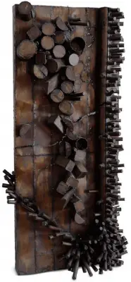
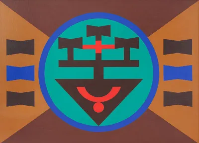
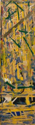
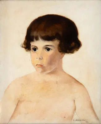
Aloísio Magalhães (Recife PE 1927 - Pádua, Itália 1982)
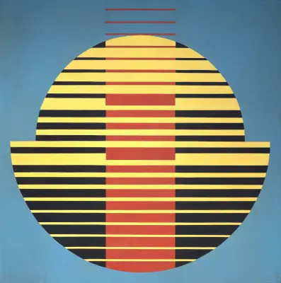
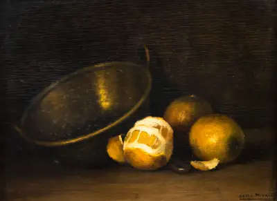
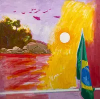
Aloísio Magalhães was a painter, designer, printmaker, set designer and costume designer. He graduated in Law from the Universidade Federal de Pernambuco (UFPE) in 1950. At that time, he took part in the Teatro do Estudante de Pernambuco (TEP), working as set and costume designer, as well as being responsible for the puppet theater. With a grant from the French government, he studied museology in Paris between 1951 and 1953, a period during which he also attended Atelier 17, a center devoted to disseminating printmaking techniques, where he studied with the printmaker Stanley William Hayter (1901–1988). He returned to Brazil in 1953.
In 1956, with a grant from the United States government, he traveled to that country and devoted himself to graphic arts and visual programming. In partnership with Eugene Feldman, he published the books Doorway to Portuguese and Doorway to Brasília, and he also taught at the Philadelphia Museum School of Art. In 1960, he returned to Brazil and opened an office devoted to visual communication, a field in which he became one of the pioneers in the country, carrying out projects for companies and public bodies.
In 1963, he collaborated in the creation of the Escola Superior de Desenho Industrial (Esdi), where he taught visual communication. The following year, he created the symbol for the 4th Centenary of Rio de Janeiro, his first work with wide public impact. In 1965, he designed the symbol for the Fundação Bienal de São Paulo. From 1966 onward, he began designing Brazilian banknotes and coins.
In 1979, he was appointed director of the Instituto do Patrimônio Histórico e Artístico Nacional (Iphan) and, the following year, became president of the Fundação Nacional Pró-Memória, launching a campaign for the preservation of Brazil's historical heritage. In his honor, the Galeria Metropolitana de Arte do Recife was renamed Galeria Metropolitana de Arte Aloísio Magalhães in 1982. In 1997, the institution's name was changed to Museu de Arte Moderna Aloísio Magalhães (Mamam).
Designer
His first involvement with graphic design was with the group O Gráfico Amador, which included leading figures of Brazilian literature such as Ariano Suassuna and João Cabral de Melo Neto. Aloísio's graphic style in this period has a lightness and informality very characteristic of the visual arts, and his first real contact with design and with the international style took place in the United States, alongside Eugene Feldman, at The Falcon Press. On returning to Brazil, he opened Magalhães + Noronha + Pontual with other colleagues, his first office (he would have several others, the most successful being PVDI Programação Visual e Desenho Industrial). In teaching, he gave a Typography course at MAM-RJ with Alexandre Wollner, and he would later be invited, together with Wollner and other designers, to found the first industrial design school in Brazil, the Escola Superior de Desenho Industrial, Esdi, where he taught. And it was for the school's 15th anniversary that perhaps his most famous text was written, O que o desenho industrial pode fazer pelo país [What Industrial Design Can Do for the Country], in 1977. He died in 1982, after serving as director of IPHAN (Instituto do Patrimônio Histórico e Artístico Nacional) and leading the main ideas related to the cataloguing and preservation of Brazilian popular culture (on an equal footing, we might say, with Lina Bo Bardi). Although my wish would be to go on talking a little more here about Aloísio Magalhães as a person and a thinker, it may be more interesting to look at what he actually designed in order to understand the scale of his importance in our history. Among the hundreds of projects he was involved in, we chose only 5 to discuss, because they are works of tremendous originality and of such graphic quality that they remain current today, and most of them are still in use (even if with changes).
We single out for analysis the projects for the 4th Centenary of Rio de Janeiro (1964), Unibanco (1965), Light (1966) and Petrobrás (1970), and his design for the new Cruzeiro Novo banknote (1966). A successful public project is one that is absorbed by the population, that becomes part of people's lives and makes them proud of something. And the first project that comes to mind when I think of these characteristics was the one for the 4th Centenary of Rio de Janeiro. Of unmatched formal simplicity, the design is made up of 2 moments of reading: the first is formed by the vertical and horizontal mirroring of the numeral 4, forming something close to a cross, thus making a link with the Maltese Cross (a Portuguese legacy of the great voyages of discovery). Within the laws of gestalt, we have closure, when a form can be read in its absence, in its counter-form. If we look at the negative space formed between the triangles of this symbol, we find a large 4, this being the 5th four in the logo. At the time, after the announcement of the competition that chose this graphic mark as the winner, many complained that it was a hermetic, closed logo that no one would understand.
However, its reception by the population was so successful that the logo became, in an entirely authentic way, kites, swimsuits, samba school costumes, commemorative drawings on walls and streets (as happens during the World Cup), tattoos, etc. It was absorbed by popular culture in such a way, just as any of us would like a project of ours to be, that I cannot think of a more successful project than this one. Formally, there is in this graphic mark a feature that would become very characteristic of Aloísio Magalhães: radial symmetry. We also find this symmetry in the logo of the former Banco Moreira Sales, later Unibanco. The radial symmetry of this symbol has a sense of infinity and rotation that would be repeated in several of the designer's works, such as those for Banco Nacional, Editora Delta, or the Quadricentennial itself. The complexity of shapes and curves he gave to the Unibanco logo reminds me of when I interviewed João de Souza Leite about Aloísio, in May of this year; he told me that what set Aloísio apart from the other designers of his time (especially those of the concrete movement in design, such as Wollner) was that Aloísio Magalhães solved his projects through drawing, and the geometric aspects were the visual and technical means of realizing the solution found through line, through drawing. I say that this complexity reminded me of that conversation because it is quite unlikely that such a symbol would have been conceived in this way were it not for this characteristic of the designer. As regards the balance between formal manipulation and respect for an institution's memory, the logo for Rio de Janeiro's electric company, Light, is a very interesting example.
In an interview with Joaquim Redig, commenting on the importance of the tradition of an identity when it is reformulated, he listed this project as remarkable in this respect. Before its redesign, Light used a small lightning bolt as its logo. In the project, Aloísio masterfully managed to keep this element, already familiar to the people of the state of Rio, and bring it into a language worthy of its time. Keeping the same language of mirroring, he used the letter L and, by flipping it vertically, created the silhouette of a new lightning bolt. By tilting the design, he gave the piece dynamism, certainly creating one of the best logos Brazil has ever seen. He managed to keep the sign already traditional for the company, combining it with the company's initial, which produced an exceptionally striking and clean, modern and simple result. The design has since been slightly redrawn, with the upper and lower tips of both Ls made thinner, without, however, losing the original concept created by Aloísio. Equally iconic in the history of design is the visual identity of Petrobrás, certainly one of the largest and most complex of its time. Before the redesign by Aloísio and his office, the Petrobrás logo consisted of a yellow lozenge with the company's name inside. In an attempt to refer to Brazil, the lozenge was an element taken from the national flag and used as the main item of this Brazilianness.
Redig told me that, in order to check whether this lozenge really referred to Brazil and whether it was an effective sign for that purpose, a survey was made of companies that used a lozenge in their logo. And, this is very interesting, Redig says that the great graphic research tool of the time (the early 1970s) was the telephone directory, just imagine! And, leafing through it, they found that the most varied companies, in the most varied fields and with the most varied intentions, used the lozenge as their main element. Gillette, Goodyear and Kibon are some of those mentioned by Redig. It was then concluded that the lozenge was not enough to identify the country in a logo, and the search for new alternatives began. It was then decided to abandon a formal language to refer to the country and to adopt chromatic and verbal language to identify it: BR is found both in Brasil and in Petrobrás, it is the abbreviation commonly used to identify the country, etc. And the project took hold, so much so that when, in 2000, a reformulation of the company's visual identity and naming was attempted, under which it would be called Petrobrax, the news shocked the whole of Brazil, which reacted, and the attempted change lasted no more than two days, returning, thus, to its old and original name. Aloísio's graphic mark was restored, and later updated by PVDI itself, but after his death. Commenting on the Petrobrax episode, Redig draws attention to the need for respect and for a historical assessment of the weight of a brand when trying to reformulate it, as Aloísio Magalhães did for Light. And, to conclude the analysis of works, touching once again on the theme of history, we have the Cruzeiro Novo project. Also through a competition, Aloísio's design was selected, and it earned (and in fact still earns) enormous praise for its innovation. Talking once with a friend, she drew my attention to the number of symbolic characteristics that a simple banknote must carry: it cannot in any way convey insecurity, it must contain elements that identify its nation, and yet it must remain within a typology that still identifies it as money, among many others.
Aloísio's innovation for the Cruzeiro Novo was not only semantic but perhaps, above all, functional. The story is very well told in the book A Herança do Olhar, edited by João de Souza Leite. In short, Aloísio used an effect called moiré, which consists of the misalignment of screens, to generate an optical effect that is difficult to reproduce. With this move, Aloísio won the competition and also innovated in a practically millennial field, that of banknote production. He took part in a second redesign, this time innovating functionally in the use of money: realizing what a great obstacle it is for money to have a top and a bottom side, which often makes it difficult to recognize its value or to sort it, he gave the notes the same mirroring that characterizes other earlier projects of his: from that moment on, the note no longer has an upper or lower side, remaining the same no matter how one puts it in the wallet or alongside the others.
Critical Commentary
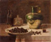
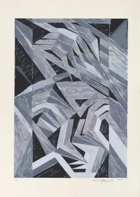
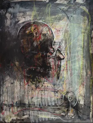
In the late 1940s, as a law student in Recife, Aloísio Magalhães took part in the Teatro do Estudante de Pernambuco - TEP, which proposed a popular theater, with performances in public squares. He worked as set and costume designer and was responsible for the puppet theater. He received a grant from the French government to study museology in Paris, where he stayed between 1951 and 1953. There he also attended Atelier 17, an experimental laboratory important in disseminating printmaking techniques, and took classes with the printmaker Stanley William Hayter (1901-1988).
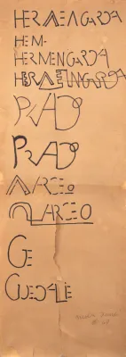
Back in Brazil, in 1953, he devoted himself sporadically to painting and carried out research in the graphic arts. He took part in the founding of O Gráfico Amador, a workshop created by a group of intellectuals interested in the art of the book, experimenting with printing techniques. The editions have a careful graphic form, and among them Pregão Turístico do Recife, by João Cabral de Melo Neto (1920-1999), with design and illustrations by Aloísio Magalhães, stands out.
In 1960, after working for some time in the United States in visual programming and graphic arts, he moved to Rio de Janeiro. He opened an office devoted to visual communication, a field in which he was a pioneer in the country, and carried out projects for companies and public bodies. He created, among others, the symbol of the Fundação Bienal de São Paulo and that of the 4th Centenary of Rio de Janeiro, his first work with wide impact, spontaneously reproduced by the population in various parts of the city. In creating symbols, Magalhães usually starts from a unit that is reflected, exploring three-dimensionality and the rotation of volume in space. He worked on the design and editorial planning of art books. In 1963, he collaborated in the creation of the Escola Superior de Desenho Industrial (Esdi), where he taught visual communication. He designed the cruzeiro novo banknote in 1966.
In 1979, Aloísio Magalhães was appointed director of the Instituto do Patrimônio Histórico e Artístico Nacional - Iphan, and, in 1981, secretary of Culture of the Ministry of Education and Culture. In the 1980s, he launched a campaign for the preservation of Brazil's historical heritage. He presented proposals especially concerning Ouro Preto and the ruins of São Miguel das Missões.
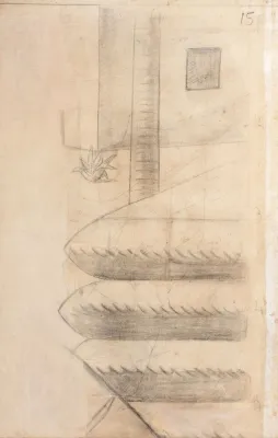
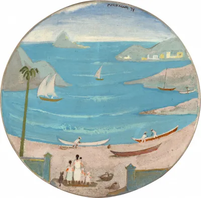
In 1972, he exhibited the series Cartemas - a name given by Antônio Houaiss -, based on the postcard, used in collages that explore the principles of the multiple and of mirroring. At this time, he produced a series of drawings of Olinda, recording its landscape and architecture in a poetic way. He stands out for his artistic versatility and, above all, for his important work in policies on cultural assets and the preservation of historical heritage.
Critiques
"Few people in Brazil could boast of the versatility Aloísio Magalhães had in his short life. It is difficult, therefore, to isolate his activity in the field of industrial design from those he carried out in other fields. He was a graphic artist of excellent standard, he was a painter, a draftsman and, surprisingly, a politician in securing the means to carry out his cultural projects.
The preservation of the national memory, which for him was almost a fixed idea, was carried out through the Fundação Pró-Memória and the Secretaria do Patrimônio Histórico e Artístico Nacional. With his incredible dynamism, he suddenly brought about, in the Culture Secretariat of the Ministry of Education and Culture, an activity that seemed impossible before he took on the responsibilities assigned to him. He obtained resources, personally took care of reconciling divergent tendencies and interests, and set up a structure that worked" (...)
José E. Mindlin
MINDLIN, José. Aloísio Magalhães: um "designer" polivalente. In: ALOISIO Magalhães e o desenho industrial no Brasil. São Paulo: FIESP/CIESP, 1983. p. 2.
Testimonials
"The disorder is only apparent. In fact, I feel an enormous fascination for this world of combinations and inventions in which lines, colors and spaces live by themselves. A new world, free and rich. A world that can truly disorient us with its exuberance. But freedom and invention also have to pay their price, as I said before. And if you prefer the real, I confess that, faced with it, I prefer what is possible. As a painter, I take pleasure in the elements of the picture and think almost physically in terms of canvas and paint. That is what pictures are built with. Accepting forms as possible - and not as real - increases, in my particular case, the joy of creation, the sense of adventure that should preside over the birth of any work of art. And if the world of the possible gives me this more than the world of the real, one must be faithful to its directions, which are unpredictable but not chaotic. In exchange for their dangers, they offer the security present in every return. Because, once made, the picture understood in this way launches into the world of art, and even into life, forms brought into the real from the unknown, creating safe ground where before there awaited us only what was obscure, formless and unstable".
Aloísio Magalhães
MAGALHÃES, Aloísio. Aloísio Magalhães. In: _______. Aloísio Magalhães: pintura e arte gráfica. Rio de Janeiro: MAM, 1958. p. 6.
"I thought that through design, in pragmatic works for collective use, I could find a much more lively and dynamic source of questions. The idea of collective participation was what interested me most. The painter's activity, being too subjective, isolated the artist a great deal from the community, and what interested me was to resume this contact in a direct and participatory way."
Aloísio Magalhães
AYALA, Walmir. Aloísio Magalhães. In: AYALA, Walmir; SEFFRIN, André (Org.). Dicionário de pintores brasileiros. Curitiba: UFPR, 1997. p. 18.
Solo Exhibitions
1953 - Recife PE - Solo, at Departamento de Educação e Cultura
1954 - São Paulo SP - Landscapes of Pernambuco by Aloísio Magalhães, at MAM/SP
1956 - São Paulo SP - Solo, at MAM/SP
1956 - Washington (United States) - Solo, at Pan American Union
1957 - New York (United States) - Solo, at Roland de Aenlle Gallery
1958 - Rio de Janeiro RJ - Aloísio Magalhães: Painting and Graphic Art, at MAM/RJ
1958 - Salvador BA - Solo, at Galeria Oxumaré
1959 - Filadélfia (United States) - Solo, at The Print Club of Philadelphia
1959 - New York (United States) - Solo, at Roland de Aenlle Gallery
1961 - Rio de Janeiro RJ - Solo, at Petite Galerie
1966 - Stuttgart (Germany) - Aloísio Magalhães - Exhibition on the Symbol of the 4th Centenary of Rio de Janeiro, at the Technische Hochschule of the University
1972 - Belo Horizonte MG - Cartemas, at EBA/UFMG
1972 - Rio de Janeiro RJ - Cartemas, at MAM/RJ
1972 - Recife PE - Cartemas, at Museu do Açúcar
1973 - Recife PE - Aloísio Magalhães: Watercolors and Lithographs, at Galeria Lotus
1973 - São Paulo SP - Cartemas, at MAM/SP
1974 - Rio de Janeiro RJ - Aloísio Magalhães: Lithographs, Watercolors and Cartemas, at Galeria da Praça
1974 - Rio de Janeiro RJ - Solo, at Ministério da Educação e Cultura
1974 - São Paulo SP - Solo, at MAM/SP
1977 - New York (United States) - Cartemas, at Fischbach Gallery
Group Exhibitions
1953 - São Paulo SP - 2nd Bienal Internacional de São Paulo, at MAM/SP
1954 - Recife PE - Pernambuco State Salon
1955 - São Paulo SP - 3rd Bienal Internacional de São Paulo, at MAM/SP
1955 - Rio de Janeiro RJ - 4th National Salon of Modern Art
1956 - São Paulo SP - 50 Years of Brazilian Landscape, at MAM/SP
1958 - Cincinnati (United States) - 5th International Biennial of Contemporary Color Lithography, at Cincinnati Art Museum
1958 - New York (United States) - Recent Acquisitions of the Collection, at MoMA
1959 - São Paulo SP - 5th Bienal Internacional de São Paulo, at MAM/SP
1959 - Munich (Germany) - Brazilian Modern Art in Europe
1960 - Venice (Italy) - 30th Venice Biennale
1961 - São Paulo SP - 6th Bienal Internacional de São Paulo, at MAM/SP
1971 - Cali (Colombia) - 1st American Biennial of Graphic Arts, at Museu de La Tertulia
1972 - Curitiba PR - 29th Paraná Salon, at Teatro Guaíra
1972 - São Paulo SP - Art/Brazil/Today: 50 Years Later, at Galeria da Collectio
1974 - São Paulo SP - 6th Panorama of Current Brazilian Art, at MAM/SP
1976 - São Paulo SP - Young Drawing of the 1940s, at Pinacoteca do Estado
Posthumous Exhibitions
1983 - Rio de Janeiro RJ - Aloísio Magalhães and Industrial Design in Brazil, at Banco Boa Vista
1983 - São Paulo SP - Aloísio Magalhães and Industrial Design in Brazil, at Masp
1984 - Rio de Janeiro RJ - Recent Donations 82-84, at Mnba
1984 - São Paulo SP - Tradition and Rupture: A Synthesis of Brazilian Art and Culture, at Fundação Bienal
1985 - São Paulo SP - 100 Itaú Works, at Masp
1990 - Curitiba PR - 1st Brazilian Design Biennial
1992 - Rio de Janeiro RJ - 1st On the Way to Niterói: João Sattamini Collection, at Paço Imperial
1997 - Porto Alegre RS - 1st Bienal de Artes Visuais do Mercosul
1997 - Porto Alegre RS - Constructive Strand and Design, at Espaço Cultural ULBRA
1998 - Rio de Janeiro RJ - 16th National Salon of Visual Arts, at MAM/RJ
1998 - Rio de Janeiro RJ - International Design Exhibition, at CCBB
1998 - São Paulo SP - MAM Bahia Collection: Paintings, at MAM/SP
1998 - São Paulo SP - International Design Exhibition, at CCSP
2002 - Porto Alegre RS - Appropriations and Collections, at Santander Cultural
2002 - São Paulo SP - Form and the Technical Image in the Art of Rio de Janeiro: 1950-1975, at Paço das Artes
2003 - Niterói RJ - Appropriations: Short Circuit of Participatory Experiences, at MAC-Niterói
2003 - Recife PE - Seeing Again/Seeing the New, at MAMAM
2003 - Rio de Janeiro RJ - Order x Freedom, at MAM/RJ
2003 - São Paulo SP - The Subversion of Media, at Itaú Cultural
2005 - Rio de Janeiro RJ - The Other Meaning of the Modern. Aloisio Magalhães and Brazilian Design, at Centro Cultural Correios
Source: Itaú Cultural